
Dropdowns
Disclaimer: I’m writing this purely from a back-end data-engineering perspective. I’ll touch a bit on user experience design, but for more information regarding that, please refer to other sources (example: Nielsen Norman Group has an article here).
The accompanying data set (Excel format; free; fake data) can be found here.
Why This Matters
Depending on the structure of your role, it might be the case that you’re juggling a few tasks all competing with one another as a number one priority. In my experience, as a data engineer and self-taught shadow-IT application designer / developer, I spent a lot of time supporting applications that were not ever meant to be my primary role. I need the data, but I don’t necessarily have time to keep up with user experience all on my own. Through this experience I learned a few tricks to create a sustainable, flexible, and scalable data collection process through drop downs that take some pressure off the application designer and allow for a truly relevant data entry point for the business units*.
*It’s important for data entry methods and design to be relevant. Users will do whatever it takes to get through their day-to-day effectively and quickly, and data entry isn’t always the forefront of the priorities. Making the data entry process relevant, clear, and frictionless will provide better chances for higher quality, more complete data (complete != quality, though).
This guidance applies only to fields already determined to make sense as a dropdown in a user experience / application for data entry (versus radio, check boxes, free form text, etc). I use dropdowns for (fields that meet all, or most of the following):
Semi-structured Data. Not quite free-form because we need to be able to roll-up / group easily with minimal text analytics, but not as structured as Date, Numeric, or Boolean fields.
Likely to Shift and Change Over Time. As business flexes over time, their semi-structured data needs will change over time. Things that are relevant during January of one year, may not be relevant in July of the same year. Being able to easily modify data entry options for relevancy as the business ebbs and flows is imperative for relevant data entry.
User Experience Modifications Based on Data Entry. Decision tree application development helps the user enter in correct and applicable data as they move through data options. For example, if they choose United States as their country in the first dropdown, then only offering them States / Territories within the US for the second makes sense. Having dynamic, applicable, and narrowed down listing options aids the data entry and data validation process at the application level to increase data quality.
As a data engineer, it might not be you developing the application side, but partnering closely with the application developer will be imperative to ensuring the data that is being entered makes sense and can be validated using systematic processes. This won’t eliminate the need for data cleansing at a later date, but it will assist by catching data quality issues before the data is written to a database.
The following techniques will assist in:
Operational Reporting. Using the below guidelines will allow the semi-structured data to be rolled up / categorized readily and easily, allowing for simple filters, group bys, and other roll-up options at different managerial levels.
Relevancy. Instead of requiring a structural change within code and database design, these guidelines will walk you through how to create a structure that requires data entry. This means a designated user can modify dropdown options at any point (with the appropriate access) without having to re-release the database or application. This means the business can own the process and own the data entry components, keeping the data entry process relevant to what they’re actually doing in “real-time”.
Historical Reporting & Consistency. Business ebbs and flows, and with it the data that is entered. Using the below methodology allows for a) documentation of how and when the data changed and b) maintenance and persistence of historical data entry and mappings.
Sounds like a data engineer’s dream!
The Goods
Where We’re Headed
The goal will be to fill in a table (I’m using relational database-speak here. Depending on what you’re developing in, some translation might be required). The table will have fields, or columns, that will power a dropdown field elsewhere, and all reporting / data analysis work can be based on it.
For example, if there is a data entry field (the field that stores data entered by the user) called: “Reason”, this “Dropdown Reason**” table will power the data validation, the data groupings, visibility / access, and historical lineage for “Reason”. We’ll use this as our example throughout and I’ll provide visual aids as best I can.
**Use your company standard for naming conventions as applicable. I’m going for readability here.
Download my fake data in Excel to play around with here (FREE).
The main data entry field in-and-of-itself is simply a text-based data type in whatever main table it makes sense for it to be in. Be sure to note somewhere if there are any limitations (i.e. character limits) as that will impact required character limits for the “Dropdown Reason” table.
The dropdown table will house data with any field needed to maintain the data for the dropdown.
My dropdown tables often looked like:
Dropdown Value ID (typically an arbitrary ID number here, auto-incrementing; follow your company standards)
Dropdown Value (this is what is displayed for the user - user experience should be carefully considered; any character limits to the main data entry field needs to match character limits here to ensure data-writes go without a hitch)
Date Entered (the date the dropdown value was entered into the table; automate this at the app level)
User Entered (if applicable to your organization, the username who entered the data; automate this at the app level)
Depending on how complex operations are, the following might need to be broken out into more tables all related to one another through the Dropdown Value ID. For the purposes of this example, I’ll simplify and pretend this isn’t necessary. An example of needing to break out into multiple tables would be dropdown options that come and go (i.e. special campaigns only relevant to one month in a year, but appear annually). It might be the case that it’s necessary (although in my experience this is over-complicating things) to have another table that has Active / Inactive dates captured so that one could trace back exactly when the option was being displayed or not to a user. This would allow a manager to go in and “re-activate” an option like “January Campaign” on December 31st, so if one sees “January Campaign” as a reason attached to a record in December, it could be traced back. Again, much more complex, and it would be part of the requirements process to determine just how granular audit-ability should be. Again, in my experience, the simplified version can handle 90-95% of the needs for these types of dropdown data entry needs.
End Date (date the option is no longer available; will be used to filter for display purposes, but without deleting for reporting / analytics)
Boolean Active / Inactive (if applicable; ask the application developer; automate this based on End Date, or vice versa, to reduce data entry redundancies, and ultimately possible discrepancies; in my example, I create this as a calculated field in Tableau Public)
Indicators for Access (“Elevated Access Required”, for example, true / false, so that the option is only available to certain levels of access for the users)
Hierarchies (could be text, could be indicators, but field(s) to indicate how this data rolls up in analyses and reports)
Sort Order (if sort is based on anything other than “Date Entered” or alphabetical, this will allow for a more detailed sorting using a simple set of integers)
Developer Notes (optional; freeform text for developers to leave notes for future developers)
Description for Users (any description / notes the User entering the dropdown option wants to display to other users entering data; think of helper icon text as an example)
For this table the granularity is the Dropdown Value. There will be redundant data entry in higher-level granularity (i.e. hierarchy groupings) so you might end up in an inception of dropdown reference tables. At some point it might make sense to hard-code in the dropdown options, or you keep rolling with these interdependencies. Be sure to use consistent naming conventions and documentation to aid in any troubleshooting and reverse-engineering that may be needed in the future.
Gather Requirements
Questions to ask:
What are the current values to be available to users?
What type of sort (this matters greatly!) is required?
Is there a hierarchy to the options, and if so, what? (i.e. Country > State; Media Type > Media Size (which could be dependent on type) > Media Color)
Are there other indicators the Application Developer needs (or wants) to aid in Hide / Show logic in the application code? (i.e. this might be an indicator for “Active / Not Active” or by user roles / departments).
This is where the table as described above starts to get filled in, but certainly structured. Identifying which columns / fields are needed is going to be more paramount than filling the table in, itself, since adding / removing columns requires structural database changes and a release process. Adding / modifying data isn’t as difficult a process. Having test data, though, will help catch any structural needs that might be hard to catch without it. Things like levels of hierarchies and user-access might be best vetted using actual examples of data that will need to be entered.
By setting the table structure proactively, it can then be surfaced through the user interface in the application such that the appropriate end-users can add in the data required to enable operational reporting and analytics. This reduces errors made by analysts as assumptions, reduces overhead / redundancies in reporting tables, and makes quick-hit ad-hoc analyses faster and more reliable.
Example
Tableau Public
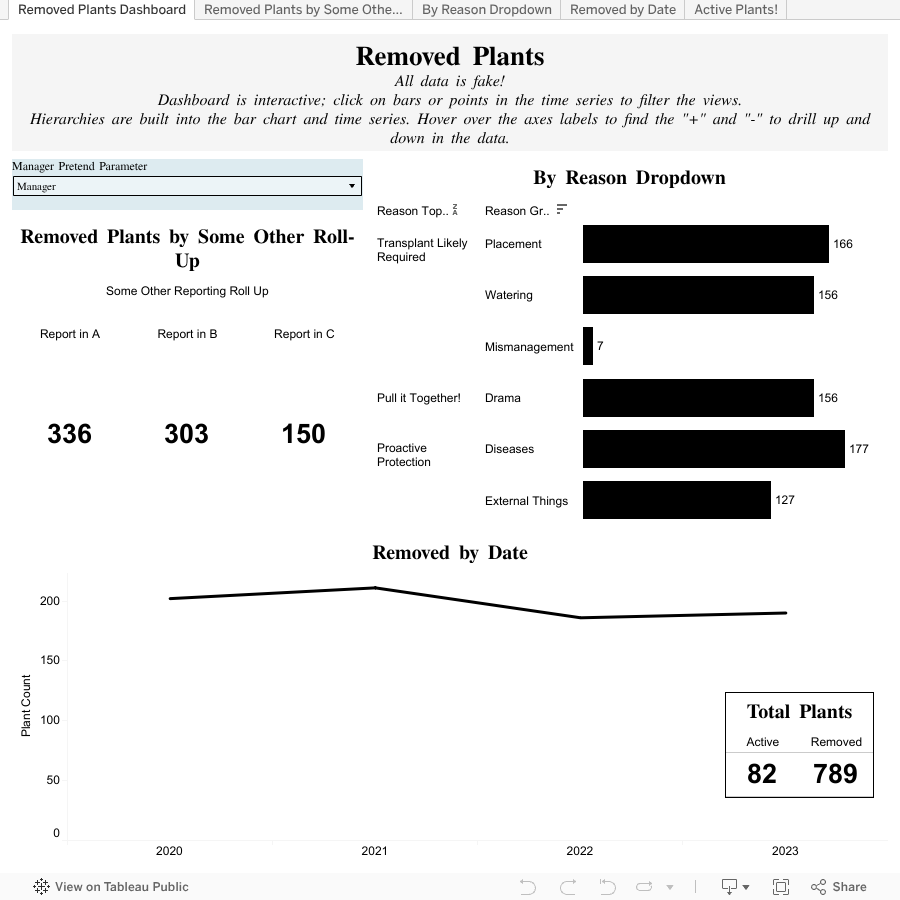
You can download this Tableau Public file (including the fake data behind it) here. I used Tableau Public because it’s free and allows for simple reverse-engineering to show in an analytical software exactly what I mean from a data engineering perspective. Again, this is all back-end discussion for facilitating reporting, analytics, and scalable data entry options for the end users. You can see in the Tableau Public demonstration that with the structure described above, I was able to provide a simple analysis with roll-ups, filtering, and historical data options, all while keeping the dropdown functionality relevant and usable by the business unit who will be entering the data.
Technical Notes
Tableau relationship: “Main Table”.“Reason Removed ID” = “Dropdown Reason”.“ID”
The data is all fake, answering the question: “What’s going on in my garden?” with hypothetical plants that have been removed from various garden beds.
The dropdown example is “Removed Reason”, which would have been made available to the data entry user group through some hypothetical application.
In the application, the application developer could use the hierarchy fields to drive what values show when for data validation opportunities. I use them for data reporting roll-ups in my visualization.
In the application, the application developer could use the “Dropdown Reason”.”EndDate” to filter out any values that should no longer be available for data entry usage.
Application: From Table to Viz
Roll-Ups. I was able to create the big numbers by “Some Other Reporting Roll Up” because of the appropriate field associated with the Dropdown value. This might be a special report that only includes certain options, or maybe a couple of different reports that need to be broken out. For example, if you are reporting to an agency or department that only cares about a sub-set of reason codes, and those subsets do not directly map to the natural hierarchy of the dropdown, you can have this separate roll up, easily maintained, and then easily grouping together the data.
Hierarchies. The bar chart is a good example of this. There were three levels to the hierarchy, which allows drilling down into the data, either by smaller and smaller bar charts or using color to create pieces-of-the-pie type charts (donuts, pie, stacked bar, etc.).
Access. Try out the “Manager Pretend Parameter”. Because of the field called “Elevated Access Required”, which might be limiting which options are available to a user on the application level, we can also filter the data to drive access levels at the reporting / analytics level. By swapping between being a “Manager” and “Not a manager” using the dropdown in blue, one can see the data changes. This application allows for different data access levels in your reporting (Note - using a parameter and calculated field in Tableau [Public] is NOT the way to actually secure your data. I was doing this as a proof-of-concept-demo. One would research / implement actual role-based security which is all well-documented in blogs and dependent on the actual software being used.)
Historical Persistence. If you were to drill down in the “By Reason Dropdown” bar chart, you’ll find under “Mismanagement” the “Great Gardening Plan of Aug 2023”. This dropdown reason is set now with an end-date. This means the end-users entering the data would not have access to this option in our theoretical application that would be filtering out inactive dropdown options. Yet, it still shows with appropriate text and values as a legitimate option in our reporting with no additional data cleansing / manipulation. Deleting / overwriting dropdown options will often times break reporting and analytics.
Data Quality Improvements. Continuing on Historical Persistence: If you click the bar (labeled with a “7”), and click out the hierarchy (click the “+” on the date axis) for the “Removed by Date” you’ll see the only data point available is for 2023 > Q3 > August. This is validated and controlled by what is available and shown in the hypothetical application using the filters available through the “End Date” field.
The Viz
View directly on Tableau Public where you can download / play around here.
Conclusion
Use this methodology to reduce application development / release overhead by allowing the business unit to keep their structural data entry options in dropdowns updated themselves. This ensures the business unit, who knows the business best, can keep their applications relevant to the work they’re actually doing. By building out an appropriate reference table, they can also provide information to analysts on how this data should roll-up in hierarchies, to be included or excluded from special reporting, or no longer be available for input (improving data quality / relevance) all while maintaining a historical mapping and persistence.
This aids in ad-hoc reporting because all of the information can be codified simply, by the business experts, requiring less back and forth between analysts and users. It aids in data quality, when data entry points are more relevant and frictionless. It reduces development overhead when business experts can maintain this reference table through data entry in an application instead of hard-coding and requiring a code-release process / schedule.
In general, I’ve used this technique in many ways throughout many applications and in various use-cases, all with great success.
Shop
As a former data professional, I’ve created a Zazzle shop, and some Etsy items, just for the #datafam. Check out my full list of designs in this blog here which I’ll keep updated regularly. Or go directly to my full-on Zazzle collection “Inside Data Jokes” here.


